CartStack
Rebrand, Brand Guidelines, Visual Identity, Logo System, Visual Language, Website, Dashboard, Illustration, Iconography Suite
THE BRIEF
CartStack is a SaaS platform in e-commerce and hospitality that allows clients to recover abandoned carts and increase their revenue. While the product drove clear results, their previous brand identity did little to convey the required trust, innovation, and personality that would help them differentiate in an increasingly competitive market.
They approached me to rebrand their visual identity, devising a modern, approachable system which would resonate with both technical and marketing audiences. This was to make it different from the usual “sea of sameness” in SaaS branding, while creating cohesion across web, product, and marketing touchpoints.
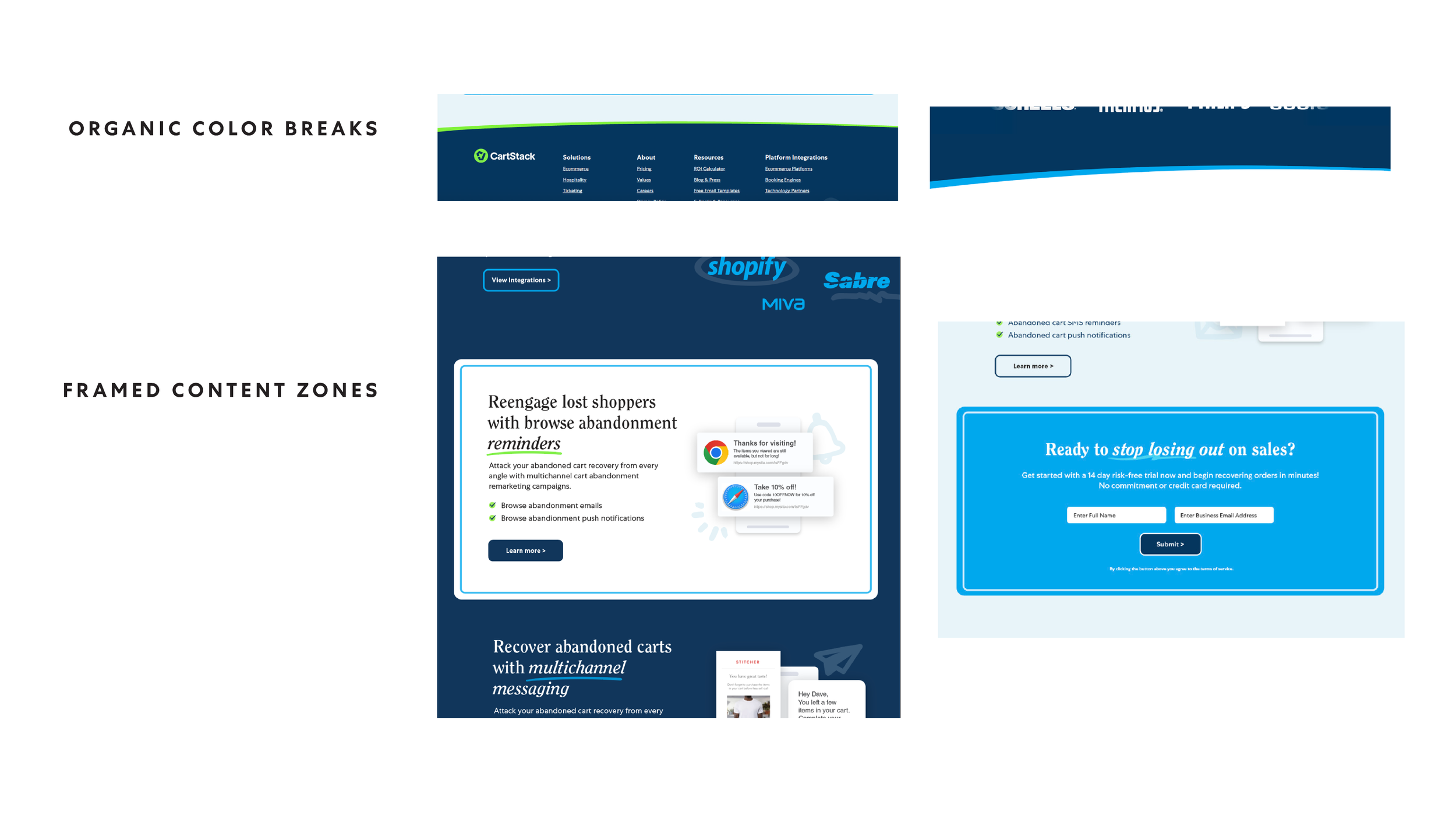
THE SOLUTION
The rebrand established a cohesive visual identity system that elevated CartStack’s presence in the SaaS space, balancing professionalism with a friendly, approachable tone. The updated logo led the way, supported by a custom-illustrated iconography suite and a distinctive typographic system. This brought warmth and personality to the brand.
Beyond identity design, the work continued into a scalable system designed with web and dashboard experiences in mind to ensure clarity, usability, and consistency across both marketing and product environments. Great brand guidelines kept this unified experience in place and empowered the CartStack team for a seamless application.


“One of the most energizing and rewarding creative experiences we've had.
From the start, Mark took the time to truly understand our brand’s mission, voice, and audience. He brought a unique blend of strategic thinking and bold creativity that elevated every visual element.”
— Colton Bradshaw, Marketing Director


View CartStack’s Brand Guidelines
Developed by Fallis Design, this comprehensive brand guidelines document provides CartStack with a complete visual language system, covering logo usage, color palettes, typography, custom iconography, illustrations, and visual accents. Complementing the look and feel of the brand definition, the work also included UX-focused recommendations that would guide layout and hierarchy for overall consistency across both marketing and product experiences.